

Facilitating employee training programs in large organizations
Learning Management System, 2023
Providing clients with a single platform
▻ The Problem
The company that hired me for this project specializes in creating employee training programs for large organizations. Hitherto, their clients were responsible for uploading training assets to whatever learning management system (LMS) they happened to use, but this created inefficiencies.
▻ The Solution
My team and I developed a custom LMS that would increase the efficiency of the company’s training programs by streamlining the handoff of assets and providing users, both administrators and trainees alike, with a simple, intuitive interface.
Working within considerable constraints
▻ The Challenge
The company had an aggressive development timeline, and there was no room to negotiate. For privacy reasons, the company also didn’t permit direct access to its user data or to its users themselves. The design process therefore had to be adapted to the realities of the project.
▻ My Role
I led a team of two designers — Quenton Juma and Nurcan Gumus. I facilitated rapid iteration of our designs through constant communication with the CEO, as well feedback sessions with stakeholders, and I translated their input into sketches and wireframes.
Understanding LMS users
▻ Building Upon Assumptions
The company shared with my team its white papers on the LMS project. These outlined some important user insights. We also had assumptions about users, based on our own experiences with employee training. These insights and assumptions formed the basis of three user personas that would guide design.

The Learner
Needs to gain proficiency in skills they need for their job.
Pain points around training:
Feels anxious or overwhelmed about learning new skills.
Doesn’t receive enough guidance from superiors.
Afraid of asking questions or making mistakes and seeming incompetent or needy.

The Manager/Coach
Needs to oversee employee training while continuing with their regular work.
Pain points:
Frustrated by the amount of time needed for supervising training.
Has to answer lots of questions and correct lots of errors.
Afraid of making mistakes that negatively impact training.

The Administrator
Needs to implement training programs in their workplace.
Pain points:
Has to answer lots of questions and correct lots of errors.
▻ Validating Assumptions
To see if our personas were accurate enough to guide our design process, we consulted training literature and surveyed professionals about their training experiences.
Findings:
All persona pain points were emphasized by all sources.
We noted a strong tension between two desires in trainees and trainers:
Trainees wanted both to be independent and to have guidance.
Trainers wanted trainees to be independent but also wanted to guide them.
To resolve this tension, an LMS should facilitate learning through:
An uncomplicated, intuitive interface.
A full, clear view of the training program.
An indicator of the trainee’s progress toward completion.
Beginning to plan the interface
▻ Competitive Analysis
In order to meet our deadline, we had to borrow patterns from existing LMS models. We consulted many platforms. Three prominent ones in particular inspired us.


Key features:
Course overview and map with time estimates.
Enables users to ask questions and make notes.
Interface:
Minimalist aesthetic reliant on text, white space, and small icons.
Generally light color palette, reserving darker shades for headers and major actions.
Screen divided into a narrow left-hand navigation and a wider right-hand area for action.
▻ Moodboard
The company already had a style guide for its website. Consisting of bold purples and blues and legible sans-serif fonts, it seemed suitable to the LMS. To confirm this, we gathered imagery reflecting important ideas for the LMS to convey to users:
Trust
Teamwork
Achievement
Simplicity
Modernity
The purples and blues and the clean lines of the imagery confirmed that the existing style guide did, in fact, suit the LMS.

Developing the interface collaboratively
▻ First Ideation
Our initial sketches proposed a basic calendar-centered interface for all user types. These gave us something to share with the CEO to start gathering feedback.
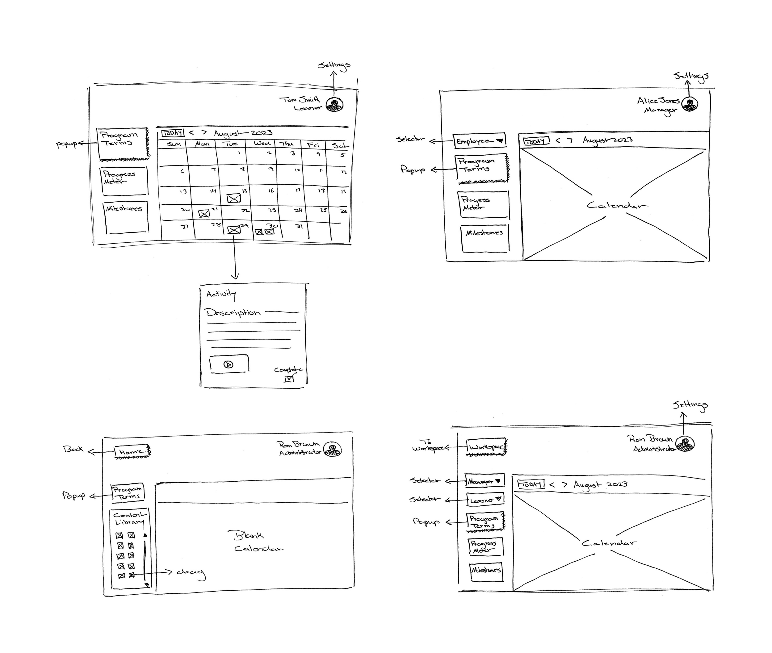
▻ Refinement
Multiple rounds of feedback on sketches and rough early wireframes resulted in fuller sketches capturing most needed functionalities, allowing us to move forward with designing in Figma.

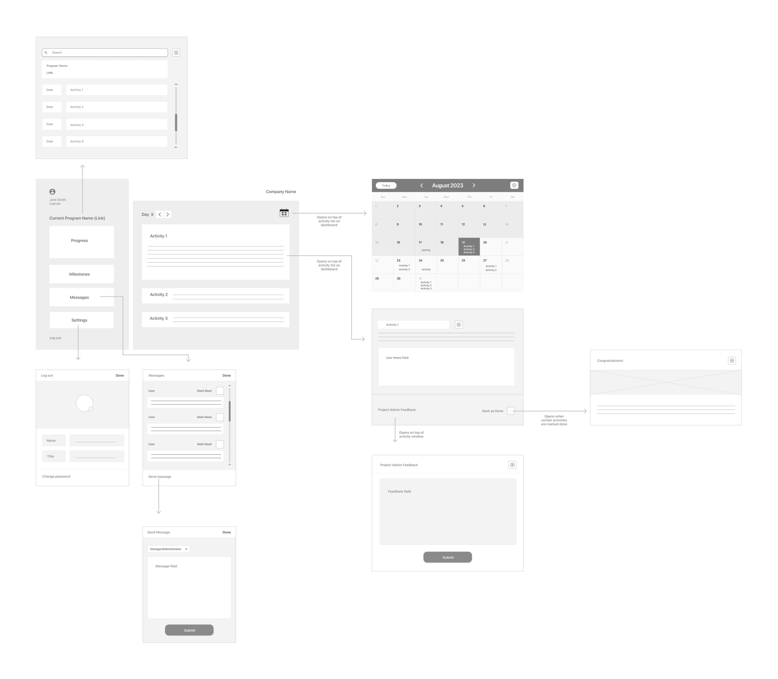
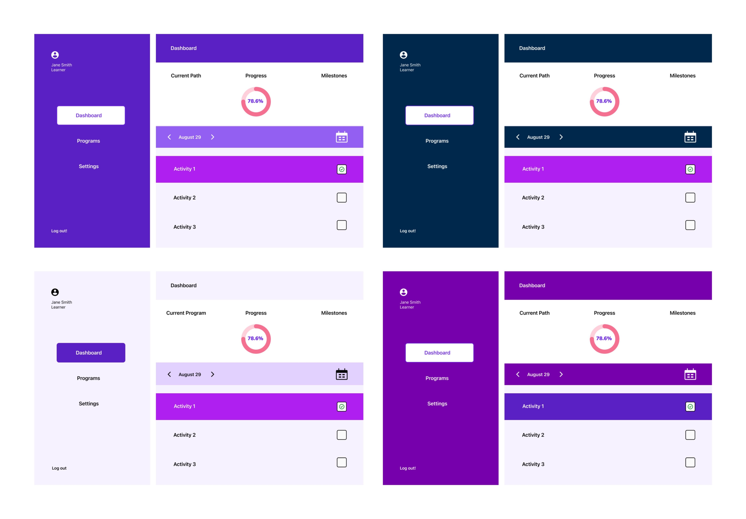
▻ Wireframes and High-fidelity Mock-ups
Based on our final sketches, we built wireframes in Figma for all three user types, giving us our first complete view of the LMS. We also made rough high-fidelity mock-ups of key screens.
Wireframes for the learner interface
Validating the design direction
▻ Round 1
We presented our work to a group of key stakeholders, including an administrator from one of the company’s major clients, a program designer from the company itself, and a representative from the team of engineers who’d been contracted to build the LMS once the design was finalized.
Feedback:
Stakeholders requested no major changes, validating our design direction.
Stakeholders requested two additional interfaces to complete the LMS, one for team members and one for one for company administrators.
“I really like that this is simple … Most LMS’s are a nightmare.”
— Program Designer
▻ Round 2
After making revisions, we presented one last time to stakeholders, including the entire engineering team.
Feedback:
Stakeholders requested no major changes, validating our revisions.
Stakeholders requested that the team member interface be discarded because it was too similar to the manager/coach interface and wasn’t necessary for the launch of the LMS.
“It’s a lot of work to make something simple … It’s very tempting to add and add.”
— CEO
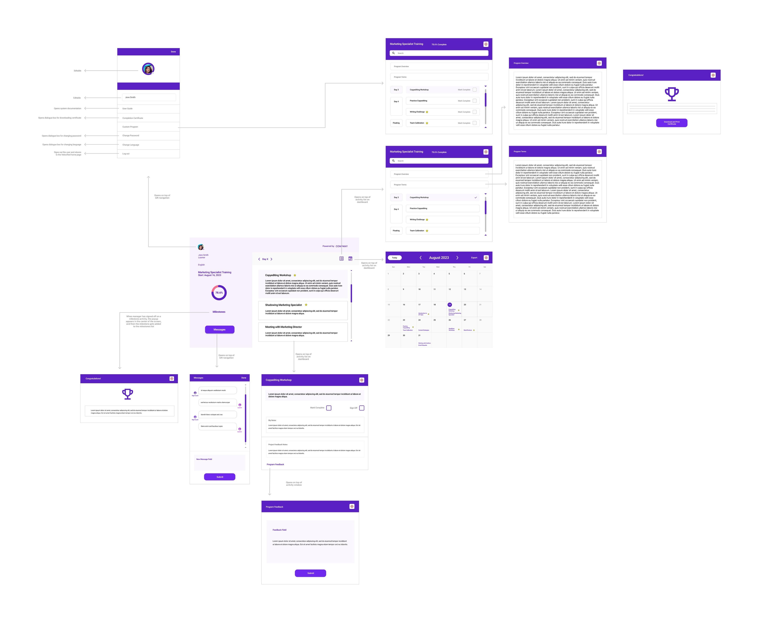
Handing off the design
▻ Deliverables
We now had a complete set of wireframes for all three user types, as well as a host of design artifacts. We packaged all of these for the company and shared them with the engineering team.
Final wireframes for the learner interface
“You really pulled it together and comprehensively captured our UX needs ... I really appreciate how quickly you responded to updates and changes and turning these around for our clients, consultant, and dev team to have the highest quality.”
— CEO
Prototype
Insights
▻ The design process must be adaptable.
Even if factors make following the full UX process impossible, the designer still has to find ways of meeting users’ needs as much as possible in order to deliver a viable product.
▻ Challenging assumptions is essential to good design.
In the absence of direct interaction with users, thoughtfully gathered stakeholder feedback can still anchor a designer’s decisions and result in a product that meets users’ needs.
▻ Make use of viable existing materials.
If a client asks for a refresh of old materials, validate them before discarding. Using old materials that still meet users’ needs is good design. As the saying goes, don’t reinvent the wheel.