

Helping local retail economies thrive in the post-pandemic world
El Locale, 2024
Connecting local businesses and customers online
▻ The Problem
During the COVID-19 pandemic, small brick and mortar stores without a strong internet presence struggled as customers shifted to shopping online. Many customers wanted to support local businesses but lacked an easy way to shop from their homes.
Even after the pandemic, these businesses have not regained their pre-pandemic success. The world has changed. And another pandemic is always possible. If small brick and mortar stores are to survive, they’ll need to connect with customers online, too.
▻ The Solution
El Locale is a startup building an e-commerce platform for small businesses — beginning with its home of Portsmouth, NH — to share their products with customers online, and to encourage a flourishing local economy in the face of uncertainty.
Stepping into the project
▻ The Challenge
Design of the platform was already underway when I came on board. The company had done substantial research into e-commerce platforms and customer behavior and drafted key screens as a proof-of-concept. But it needed help refining its designs and developing additional screens to create a complete prototype for testing.
▻ My Role
I led a team of three designers — Stephanie Hua, Leah Kusumalayam, and Gautam Reddy — translating the company’s research into user flows, synthesizing the CEO’s feedback, and knitting our collective screens into a prototype in Figma.
Determining the scope of the prototype
▻ Synthesis of Existing Research
The company’s research offered insights into customers’ needs and the mental models they lean on in using e-commerce platforms. We determined a core set of tasks that customers would have to perform in order to use El Locale successfully:
Creating an account
Searching for an item/business by name/category
Adjusting search results by distance
Saving an item/business for later
Adding an item to the cart/editing the cart
Purchasing an item
Seeing account details
Updating an order
Saving a credit card to the account/editing the credit card
Adding/updating billing/shipping information
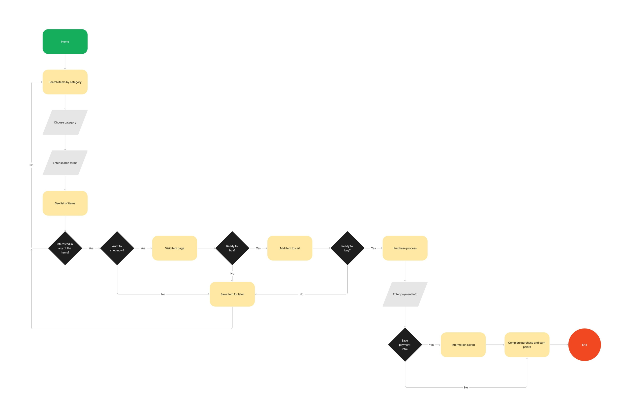
I mapped out these tasks in a series of user flows that helped us identify the screens that still needed to be designed and how the prototype would fit together.
Purchasing an item
Designing the remaining screens
▻ Additional Competitive Analysis
A number of new screens would need to be designed: for instance, screens for account creation. The platform was already heavily inspired by e-commerce giants Amazon and Etsy, so we consulted them for tried-and-true patterns to adapt.

Features:
Account creation/signin accessed through an “Account” link in top-level navigation on all screens
Clicking “Account” triggers a popup with a signin button and an account creation link
Verifies new users through a text message

Features:
Account creation/signin accessed through a “Sign in” link in top-level navigation on all screens
Clicking “Sign in” triggers a popup form for signin with an account creation button
Verifies new users through email
▻ New Screens
In the case of account creation/signin, Amazon offered a simpler, cleaner flow than Etsy and better matched El Locale’s aesthetic. But we also made use of Etsy’s verification process for new users because it didn’t prioritize phone interaction.
Flows in Amazon and El Locale:

▻ Updates to Existing Designs
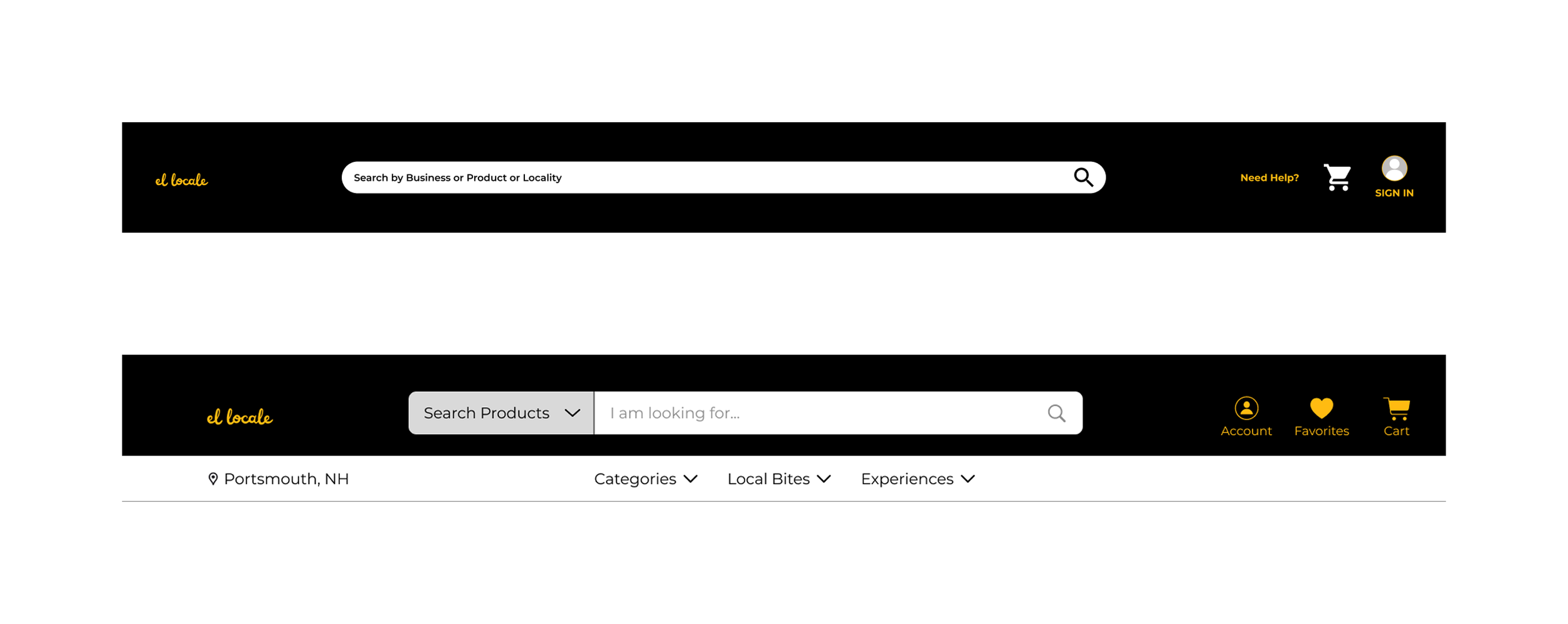
New designs also revealed certain limitations of screens and components that had already been designed. For instance, the original navigation header didn’t account for the user’s location, favorites, or searching by categories. This had to be remedied.
Original and final navigation bars:
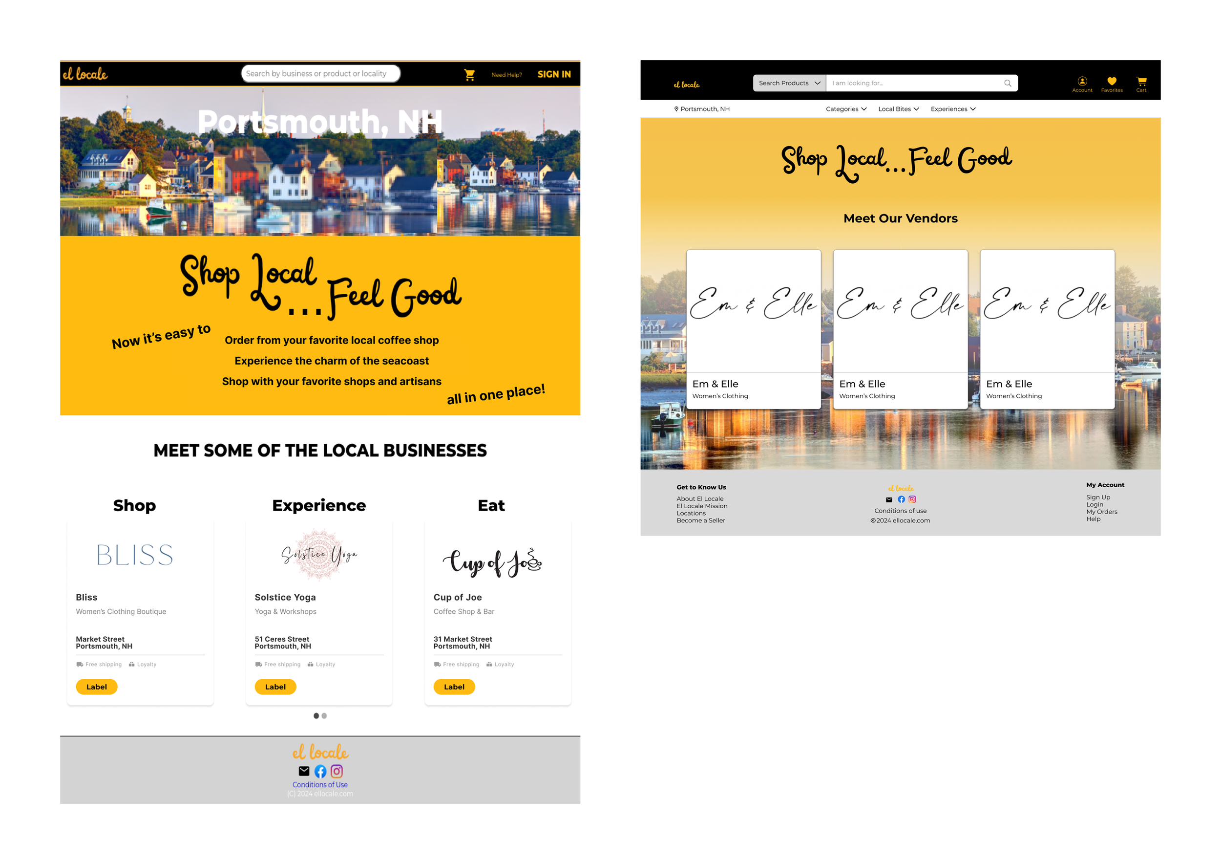
Original and final home screens:
Validating the prototype before testing
▻ Company Feedback
After completing the new screens and updating the existing ones in Figma, we had a full prototype for presenting to the CEO. We’d already had her feedback throughout the design process and felt confident that our work aligned with the company’s vision, but this final round of feedback was needed for identifying any gaps before testing.
Feedback:
The CEO requested no major changes, validating our design direction.
Some screens needed simplification, because not certain features would be rolled out after the launch of the platform.
▻ Final Screens
The prototype prioritized simplicity of interaction and a minimalist aesthetic that would translate easily across devices, making the platform suitable for all types of customers, regardless of age and comfort with technology.
Ex. Item and business search results

Prototype
Insights
▻ Make the products shine more than the platform.
Small businesses may sell unique and handmade products, but an e-commerce platform for small businesses doesn’t have to call attention to itself as artisanal, as well. Customers want to discover great products, so rely on familiar patterns and keep the platform simple.
▻ Leverage users’ mental models for the sake of accessibility.
Most people have experience with at least Amazon, Etsy, and similar online shopping platforms. Adapting patterns from these for a new platform will help users across a range of ages and abilities to navigate the platform successfully right from the start.