

Reducing patients’ anxiety while waiting in the ER
assistER, 2022–23
Empowering patients with information
▻ The Problem
Across the US, ER wait times have been trending upward for decades. During the COVID-19 pandemic, they reached an all-time high, with reported wait times of up to 48 hours.
Long ER wait times aren’t just a small frustration for patients. They correlate with significantly decreased satisfaction, which makes patients more likely to leave the ER without being seen or to avoid returning even when they need to. This puts their health at risk.
▻ The Solution
assistER is a mobile app that minimizes frustration and anxiety among noncritical patients, as well as the people accompanying them, during long waits in the ER by keeping them well informed through real-time updates, alongside features meant to help them be more proactive.
Keeping the focus on patient advocacy
▻ My Motivation
In the fall of 2022, my doctor had me visit the ER for tests related to what eventually turned out to be just a migraine. I waited more than nine hours and often felt ignored or forgotten. Other patients also appeared frustrated. I wanted to do something to channel that frustruation productively.
▻ My Process
I’d heard doctors themselves say that the US hospital system was a tough beast to wrangle, particularly in terms of patient privacy laws. I wasn’t a medical or legal professional, but even if I developed a solution that couldn’t readily be implemented, it would be an act of patient advocacy.
I took my time studying the problem, surveying and talking with patients and their loved ones who’d waited in the ER, then developed a proof-of-concept for an app synthesizing my findings.
Learning from experts in the field
▻ The Literature
I had strong feelings about my own ER experience, but I needed to understand ER wait times in a broad context. I sought out existing data related to ERs from the past 10 years, consulting medical journals, news stories, and health care websites.
Key findings:
ER wait times in the US are longer than ever and increasing.
Long wait times increase patients’ stress and decrease satisfaction.
Dissatisfied patients are less likely to follow through with medical care.
Patients’ stress might be mitigated by keeping them better informed.
“Among the most stressful situations you may ever experience is sitting in the waiting area of a hospital emergency room while you or a loved one is in pain and discomfort from a sudden injury or illness. By its very nature, you may think, an emergency room is a place where waiting for care should never be necessary.”
— The Health Nexus, “In Case of an Emergency: ER Wait Times Explained and More”
▻ Competitive Analysis
I also needed to know what digital products were already being used to communicate with people in the ER. I focused my attention on two major types of mobile apps.


▻ Patient Portal Apps
Patient portals have become almost universal in health care systems in recent years. MyChart and Healow are the two most prominent examples.
Features:
Capture patients’ medical history
Real-time test results and updates
Extensive functionality, including messaging
Limitations:
Complex interfaces
Potentially overwhelming quantity of features

▻ Medical Communications App
Ease is a new app designed specifically for communicating with patients and their loved ones during medical visits.
Features:
Streamlined interface for text and video messages from medical staff
Limitations:
Principally passive user experience
Doesn’t capture medical history
Few functions and no use outside medical visits
Learning from patients themselves
▻ Survey of ER Goers
To build upon my new understanding of ERs as a problem space, I conducted a survey of people who had been to the ER in the US within the previous two years. This helped me to identify the principal types of ER users and their top challenges.
Principal ER users:
Patients in noncritical condition
People accompanying patients in noncritical condition
Top challenges:
Long wait times
Not knowing how long the wait would be / frustrating paperwork
Unhelpful or rude medical staff

▻ Interviews with Survey Respondents
Of course, statistics can convey only so much about human experience, so I contacted survey respondents to see if they’d be willing to discuss their pain points in depth. Six agreed.
Subject characteristics:
Visited the ER in the US at least once in the past two years
Was either a noncritical patient or accompanied one
Between ages 18 and 45
“I got kind of panicky, just because I didn’t know what was going on ... I didn’t know what the course of action was. I didn’t know what to expect. I didn’t know anything. And so already sitting there in pain worse than any I’ve really felt hardly ever, and then not being told anything about what’s going on with me ... It added to the fear.”
— Interview Subject
▻ Analyzing the Interviews
To translate my interview data into a direction for design, I categorized what the interviewees had said according to commonalities.
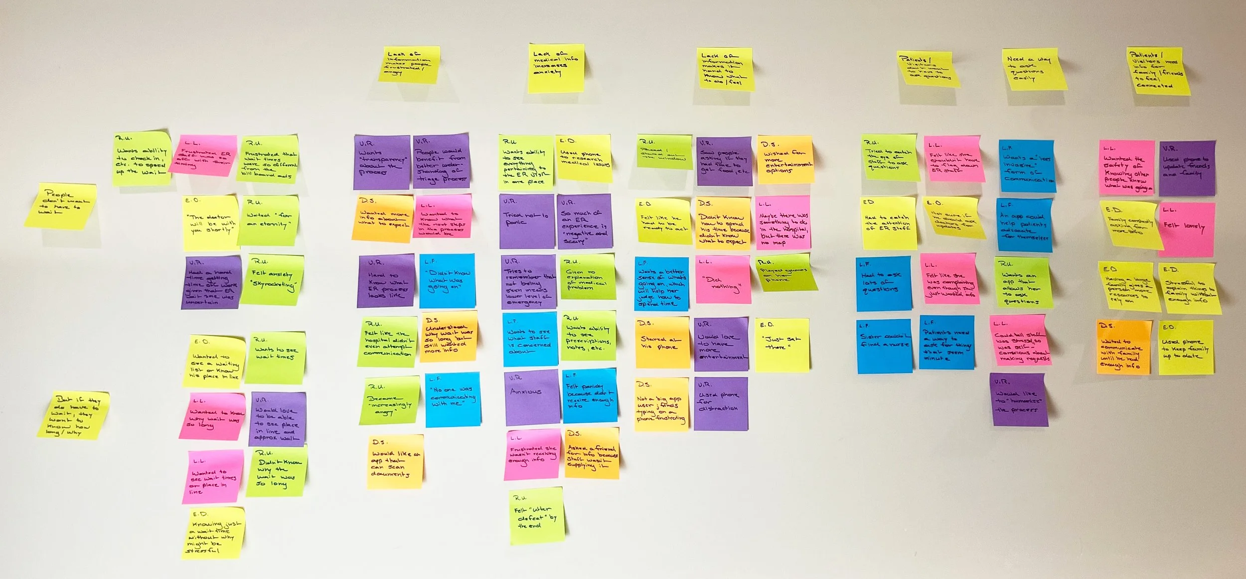
Shared traits of people waiting in the ER:
Strongly dislike having to wait for a long time
Want to know the expected length of the wait
Want to know why the wait is so long
Don’t know how best to spend their time
Are frustrated by lack of communication from medical staff
Dislike having to go to staff to ask questions
Want a simple, unobtrusive way to ask questions
Want information to share with family, friends, etc.
▻ User Personas
I developed two user personas based on these shared traits, one for each of the two major types of people who use the ER, to keep my thinking centered on user needs while designing an app.

The Independent Patient
Young professional
Has a minor ongoing health issue
Typically goes to the ER by themselves
Goal: Receive medical attention and return to normal life as quickly and painlessly as possible
Wants a simple way of gathering details to understand the scope of the visit, utilize their time while waiting, and update coworkers and loved ones

The Supportive Partner
Young professional
In a relationship with someone who has a minor ongoing health issue
Typically goes with their partner to the ER
Goal: Provide support to their partner to help them return to normal life as quickly and painlessly as possible
Wants to know the basic details of their partner’s ER visit so they can best help their partner without having to ask lots of questions
Generating design ideas
▻ First Design Ideas
In a series of rough sketches, I began brainstorming possible ways to help the user personas achieve their goals, entertaining even fanciful ideas such as a cartoon virtual assistant.

▻ User Stories
In between sketches, I also outlined the ways in which users might engage with an app during the stages of an ER visit, from creating an account to following up with a doctor after a visit.

▻ Ideation, Round 2
Having plotted out and prioritized possible uses of the app, I selected the most practical ideas to explore. My sketches revolved around a simple dashboard showing the user’s place in line.

▻ Information Architecture
A design direction was coming into focus, so it was time to map out the functions of the app to determine what screens I needed to design and how they connected.

Refining the interface
▻ Paper Prototype
I sketched the main screens on paper, scanned them, and used Marvel POP to assemble a rough prototype of the app to test on users for gathering feedback before moving on to more sophisticated software.
▻ Guerilla Testing
I conducted in-person usability tests with five people, asking them to imagine being in an ER as a noncritical patient. I gave them a series of scenarios that required using the app. All participants successfully navigated the scenarios and praised the app’s simplicity, confirming the direction of design.
“I like the simplicity of [the app]. I don’t think that hospital apps should be complicated.”
— Test Subject
▻ Aesthetic
The shape of the app had been determined. The next step was to determine the look and feel. I gathered imagery reflective of key ideas that the app would need to convey to users.
Clear guidance
Comforting assistance
Reliability
Partnership

Imagery of people supporting each other, giving directions, and being helpful suggested a calming, muted color palette and simple, unadorned visuals.
Interfaces
▻ Interface Evolution
Moving from the paper prototype to a final design was a long process with many stages. After I built the interface in Figma, I explored visual variations based on the style guide.

▻ Key Screens

Home
A hub for the user’s current ER visit
Features:
Prominent status indicators that help the user to understand the state of their ER wait at a glance
Access to important features that help the user to be more proactive during their wait
Access to standard data about the current ER visit

Ask Blue
A chatbot that answers users’ questions and prevents overreliance on medical staff
Features:
Users can type questions or select frequently asked questions from a list rather than type everything
Offers standard answers, alerting staff only to complex questions or urgent needs requiring assistance

My Notes
A place for users to record information for personal use or to share with contacts
Features
Users can write text-based notes or record voice memos
Users can share notes with their contacts
Validating the design
▻ Usability Testing
I conducted two rounds of usability tests on the prototype, each with five participants who had a set of scenarios, which helped me confirm what was working and what had room for improvement.
Round 1 findings:
All participants successfully navigated the scenarios, validating the design.
Participants appreciated the proactive features and suggested more.
Participants asked for more control over what the “Share” feature shared.
Round 2 findings:
All participants successfully navigated the scenarios, validating the revisions.
Participants at first didn’t understand that the “Home” screen pertained to the current visit.
Participants were curious about what the home screen would look like outside medical visits.
“I liked the simplicity and straightforwardness of the information. It was very clear where I was supposed to go to get what I needed.”
— Test Subject
Prototype
Insights
▻ Be aware of diminishing returns.
The amount of data pertaining to ERs is vast. Background research for this project could have gone on forever, but the more sources I consulted, the more they said the same things.
▻ Some issues should be bracketed.
Patient privacy policies are notoriously knotty. My project might have derailed if I’d tried to account for them fully from the start. I opted instead to pursue a proof-of-concept that demonstrated and explored user demand and that could be refined later with the help of experts in the field.
▻ Engage users in ways that matter.
Apps are often designed to keep users engaged through gamification, news feeds, social components, etc. But in situations such as medical emergencies, what users need most in an app is something that performs a specific function and doesn’t monopolize their attention needlessly.